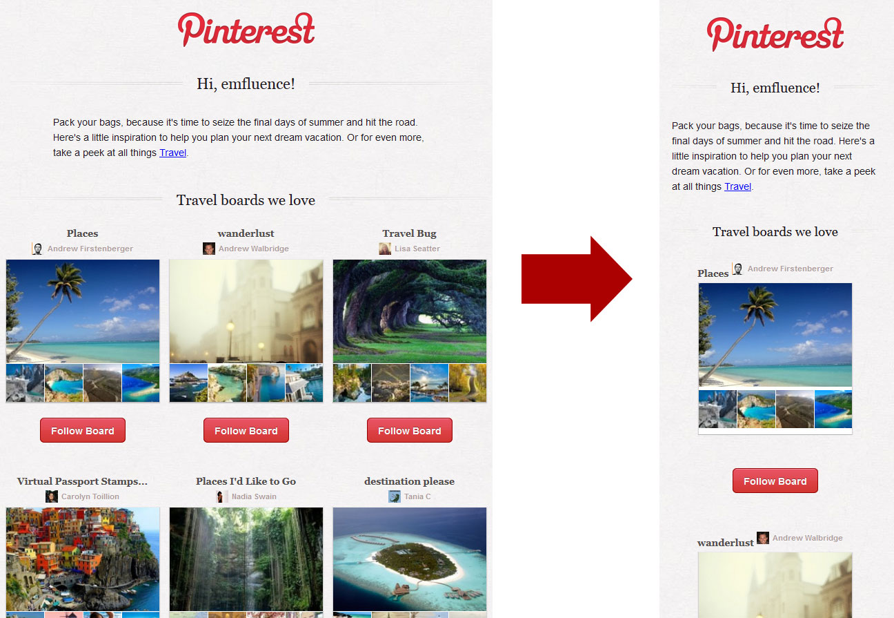
One of the world’s social media darlings (70 million+ users as of July 2013) proves why email + social = love. Pinterest has been a model user of email marketing since its first full year as a social medium. This week, Pinterest announced its new “price reduction alerts” meaning they’ll email you when a rich pin‘s price decreases.
More fun for me, though, is watching the emails they send. Ever received your Pinterest email on your phone and seen the same email on your desktop (Gmail or Outlook)? Notice the clever shift between mobile version and desktop version? It’s a simple 2-version email, where if the screen the reader is viewing on is less than 480 pixels, the mobile version is shown and if more than 480 pixels the web version is shown. Check out Pinterest’s 2 email versions here, by playing with window size and watching where it switches between the two.
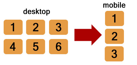
This email is a great example of the decisions email designers and coders have to make when considering responsive (or adaptive) email design: notice the shift from full to narrow screen and what order the pieces fall in as it shifts.
If you’re watching the device reporting on your emails and see that many of your subscribers are opening on a mobile device, this visual, modular email design is a great opportunity to mobile-optimize your emails in a fairly simple, straightforward way.
If you need some guidance, Anna from Style Campaign has a great 1-hour webinar on her blog talking about a wide variety of mobile-optimization techniques! Need a bit more help? The HTML team at emfluence can help you code your own mobile-responsive emails. Give us a shout at expert@emfluence.com.


